Identity

Logo Design

This page brings together a small logo set ranging from formal community identity to expressive wordmarks and stripped-back symbols. Each piece explores a different balance of readability, atmosphere, and personality.

Pieces

6 Concepts

Range

Formal to Experimental

Main Thread

Shape + Recognition

Focus

Memorable Visual Tone

What Stands Out

Across these images, the strongest ideas come from pushing one clear visual move at a time instead of overloading the mark.

  • The wordmark pieces lean on tall perspective, heavy outlines, and dramatic framing to feel loud and unmistakable.
  • The minimal symbols use vertical bars and sharp peaks to suggest architecture, height, and stability with very little detail.
  • The emblem approach uses rings, typography, and national references to communicate community and identity more directly.

Reading The Set

The collection feels like a mix of polished directions and exploratory sketches, which makes the process visible instead of only showing final marks.

  • Some logos are built for impact first, especially the luminous ROOTONSET variants.
  • Some are reduced to core silhouettes, which helps test whether the idea survives without effects.
  • Some images read like rough concept captures, useful for finding a unique motion or attitude before refinement.

Highlights

Featured Work

Circular logo for Bahcesehir University Iranian Students Community

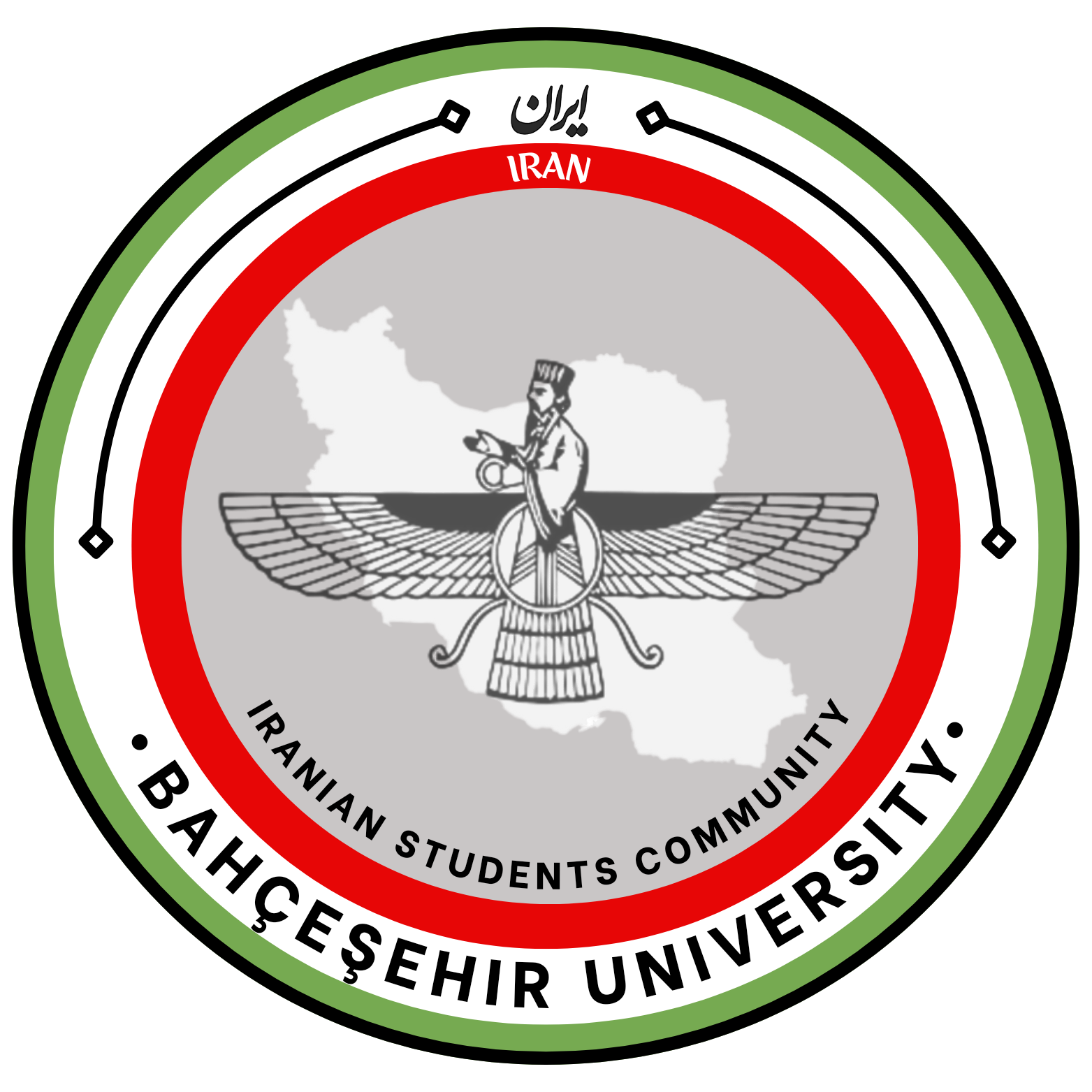
3. Bahcesehir University Iranian Students Community

This circular badge feels official and community-driven. The outer rings, bilingual naming, and central Iranian imagery make it read more like an institutional emblem than a startup logo, which suits a student association well.

EmblemCommunityInstitutional
Neon ROOTONSET wordmark on a black background

4. ROOTONSET Neon Wordmark

The glowing treatment gives this version a strong gaming or music-brand energy. The mountain-like silhouette around the lettering makes the word feel carved into a peak, which adds scale and drama.

WordmarkNeonHigh Energy
Black and white ROOTONSET wordmark

5. ROOTONSET Black and White

This black-and-white version strips the concept back to form and contrast. It keeps the same towering perspective, which is a good sign that the core shape is memorable even without color or glow effects.

WordmarkMonochromeForm Study
Minimal black symbol made of five rising vertical shapes

6. Minimal Peak Symbol

This mark is extremely reduced: just a few vertical forms building to a central peak. It reads like a skyline, a crown, or a stylized monogram, so it has flexibility, but it may need more surrounding brand context to feel unique.

MinimalAbstractArchitectural
Abstract black and white symbol with jagged electric accents

7. Experimental Lightning Mark

This feels raw, aggressive, and motion-heavy. The central shape suggests a slashed letterform with electric or flame-like accents, which creates attitude fast, though it is less immediately legible than the more structured pieces.

ExperimentalDynamicEdgy
ROOTONSET wordmark with a silver and purple-red gradient

8. ROOTONSET Soft Gradient Variant

This version softens the neon direction into something more polished and product-ready. The gradient and drop-shadow still give it depth, but the lighter background makes it feel more versatile for broader brand applications.

WordmarkGradientRefined

Explore the full portfolio

Return to the homepage to browse the full portfolio and contact section.

Back to Home